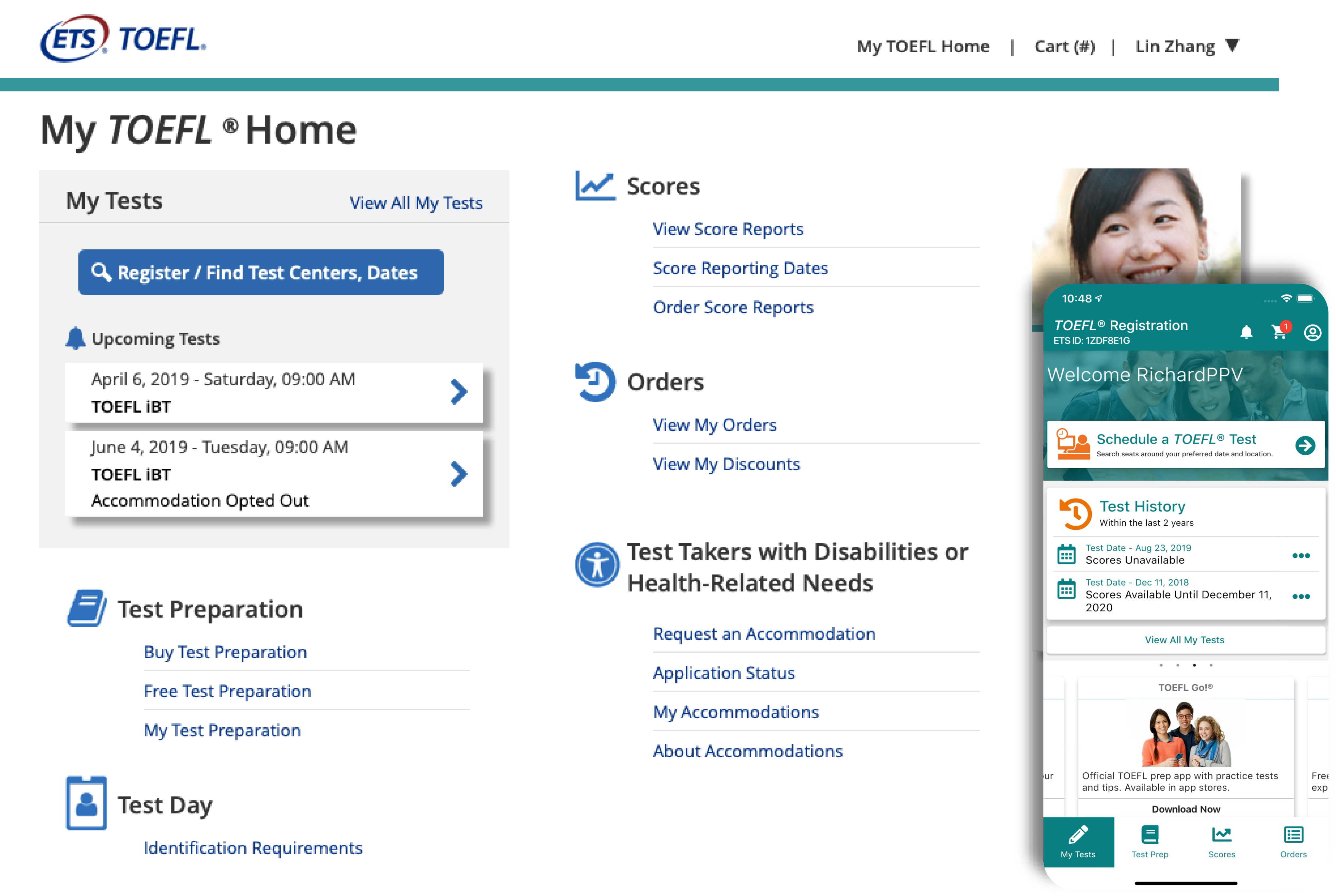
TOEFL E-Registration Redesign
My Role
Research, User flows & stories, Sketching, Wireframing, Visual Design, Prototyping, Usability testing
Categories
Application Design, Mobile Design
I can only disclose limited content and design due to the non-disclosure agreement (NDA) in place. The project encompassed the design aspects of customer service representative interfaces as well as mobile application design.
Overview
001
The electronic registration (e-reg) system allows users to register for an ETS product or exam.
ETS wanted to create a one-login experience, where users can register for exams across all products using one login to register and view scores. This will help regulate processes and verification procedures for the long run and give our users a dynamic experience using ETS products.
The redesign for the registration system is based on the following products: GRE, TOEFL, PRAXIS, and HiSet. We performed round 1 usability testing (pre-design) for GRE and did extensive research for all registration systems. The TOEFL exam has large international user base, which made it the most complex. To initiate the process we started redesigning the TOEFL Registration system. The redesign will lead to the other products upon completion. This will then allow the goal for”MY ETS” to launch where users can use one login for all products under the ETS umbrella.
The Problem
The registration system was causing low engagement globally and negative feedback from customers calling the call center were increasing. We wanted to improve processes, redesign the user interface, provide clear content related to the registration for the intended users, and address critical issues or areas of confusion.
The Outcome
I led the usability testing and created a design system, lead a junior designer, delivered high-fidelity mockups, worked with developers, interfaced with clients, and delivered a solution to improve their process. We increase optimization by 85% and calls routing to the call center decreased by 53%. This redesign set the footprint for future redesigns to come.
Initial Discovery
002
Getting Acquainted
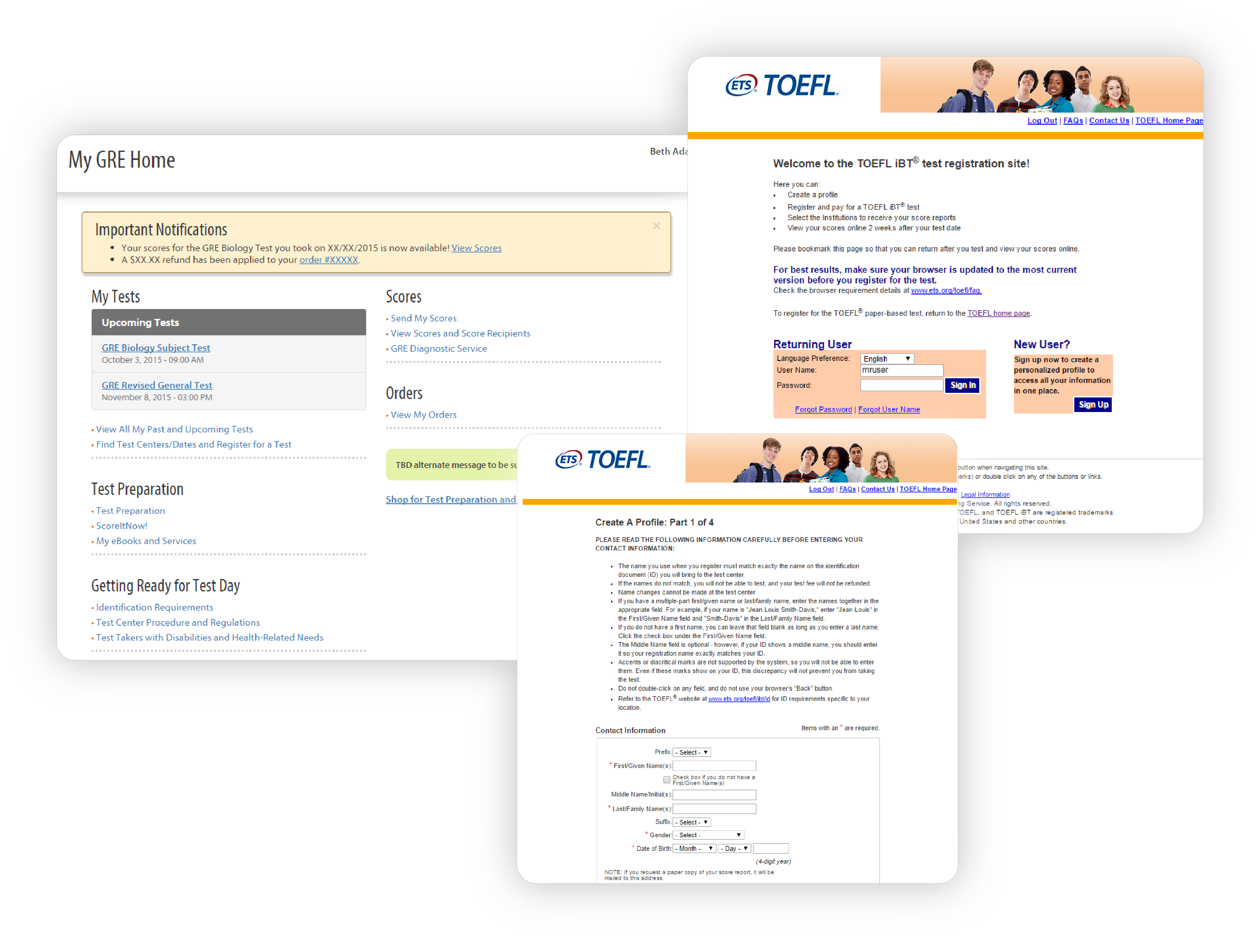
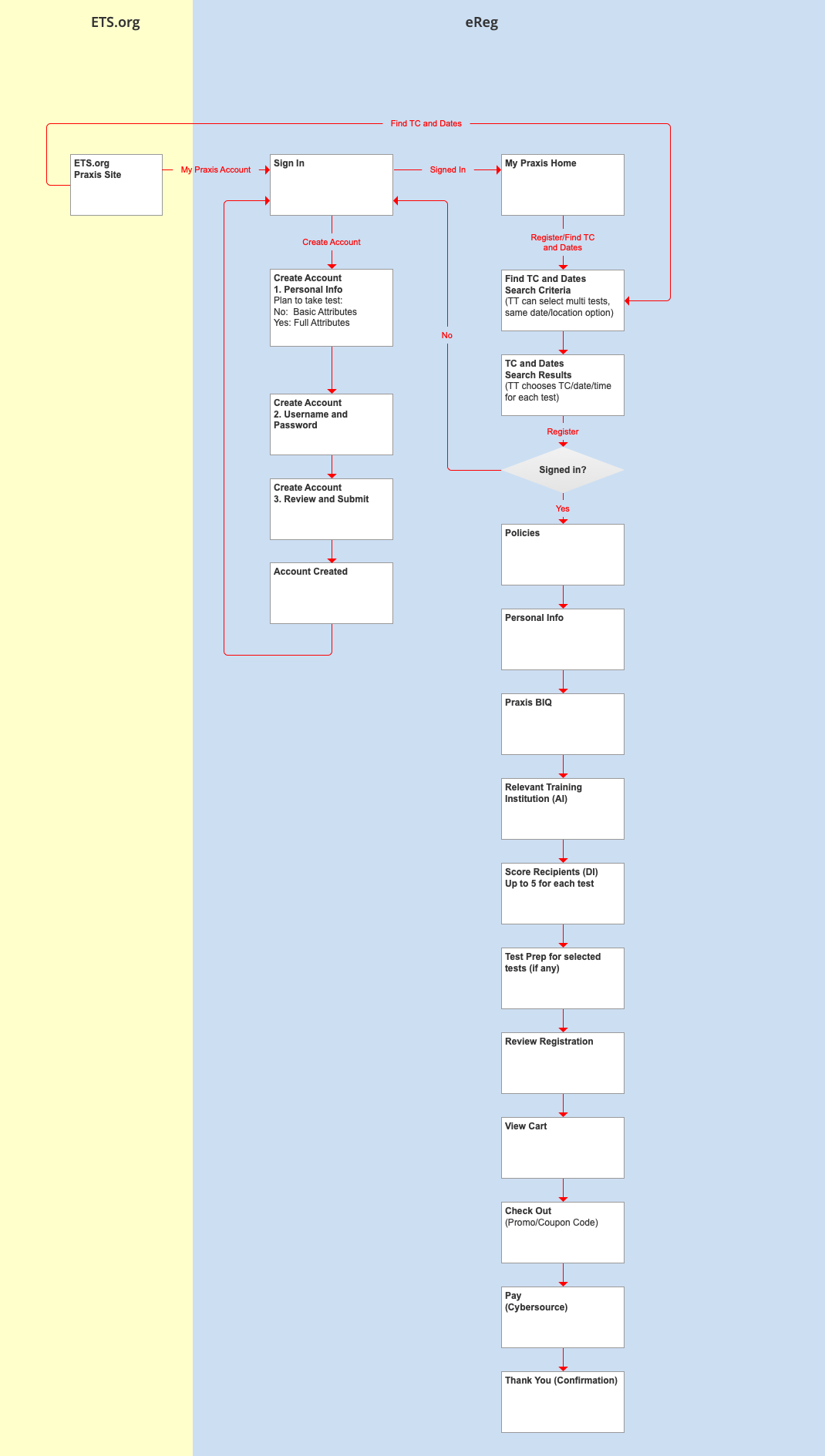
Something I like to do at the beginning of a project which involves adding a new feature into an existing product is conduct an initial discovery of the existing product. Basically, I go through the product and create a user flow as well as annotate screenshots of potential areas of impact.
Testing the Registration System
003
Evaluating the Current Experience
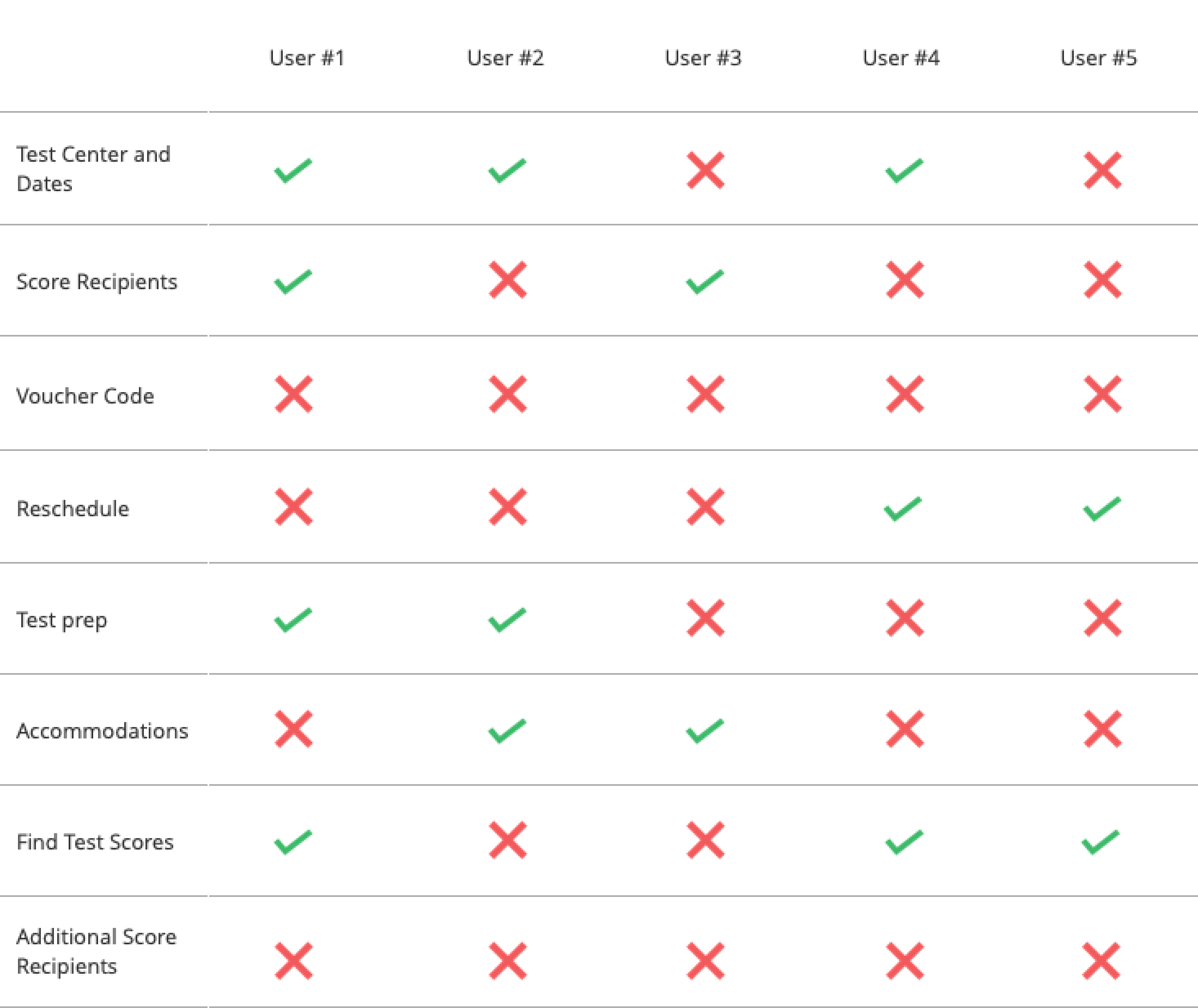
After the initial discovery, I decided to run a usability test. The purpose of the usability tests was to confirm whether the processes, user interface, and content related to registration are clear to the intended users, and to determine whether there are critical issues or areas of confusion that need to be addressed. We broke them down into the following task
01. Find and select a test center and date you would like to take the exam.
03. Registering for a test – Enter voucher code for registration
05. Registering for a test: How do you purchase test preparation for your exam?
07. After taking the test: Where can you find your scores and where can you learn about next steps?
02. Registering for a test: select your score recipients in the registration process
04. How do you make changes to your test center location and/or date of your appointment?
06. How do you make accommodation for your upcoming test?
08. After taking the test: How do you send scores to additional score recipients?
Quantifying Problems
004
Usability Testing
The results showed a glaring issue. With only 35% of the tasks being completed successfully, I knew the registration system was difficult to understand and navigate without external help
Insights
005
Major Findings and Uncovered Insights
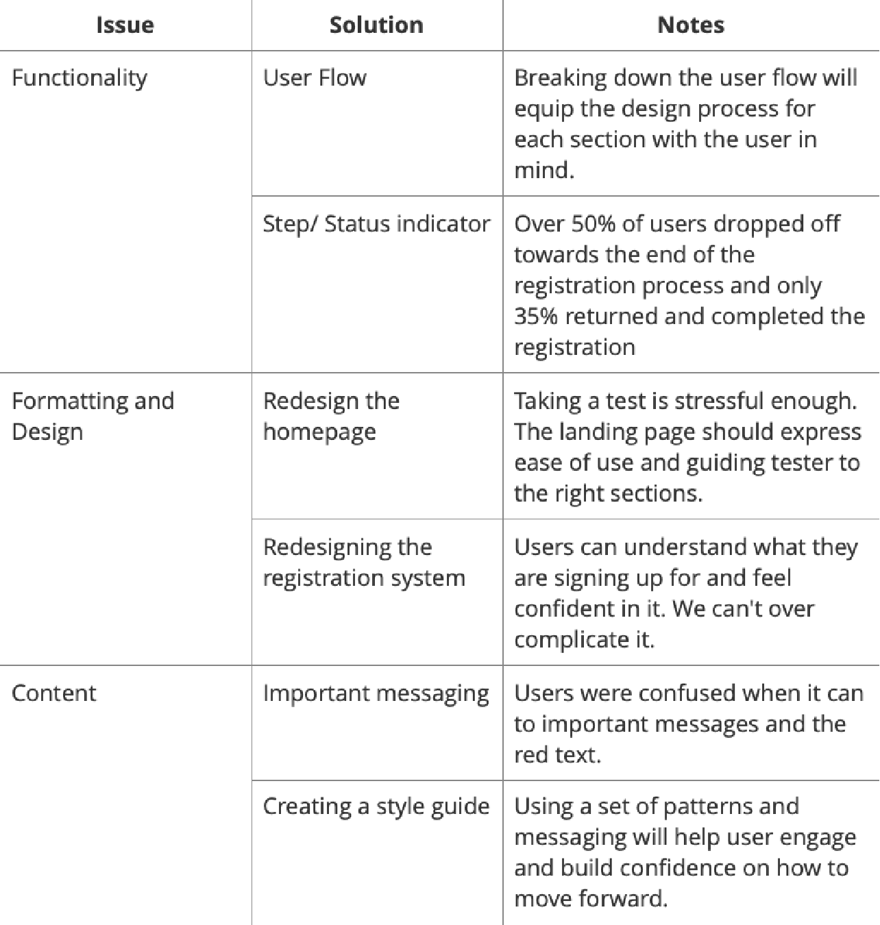
Based on the usability test and follow-up interviews, there were the many pressing issues that needed to be addressed throughout the registration system. I narrowed down each issue into a category.
Functionality
A few users had a hard time knowing where we were at in the registration process. The flow of the registration process was very repetitive and that confused the users. The current interface provided no status indicators, or specific messaging styles for users.
Content
Important messaging was being missed or blended in with other content. There were also usability issues that led to people not completing the registration process.
Formatting and Design
A Major issue expressed by every tester was the lack of design and formatting. Testers were confused in the following section: late fees, accommodations, test centers/ dates, test prep. Ironically call centers received a high volume of call regarding the same topics.
EXPLORING POSSIBILITIES
006
Ideation: Prioritizing Quantity for Effective Solutions
Upon uncovering numerous issues during the research phase, I gained a profound understanding of the project’s magnitude. To effectively address these challenges, I condensed my research findings into clear goals. This deliberate process allowed me to ensure that my subsequent design decisions were firmly rooted in the insights obtained from user research, ultimately leading to solutions that effectively tackled the identified problems. By emphasizing quantity in generating ideas, I aimed to explore a wide range of possibilities, enabling me to select the most viable and impactful solutions that aligned with the user needs.
Issue #1 Functionality
007
Reducing Steps to Ensure Ease of Use
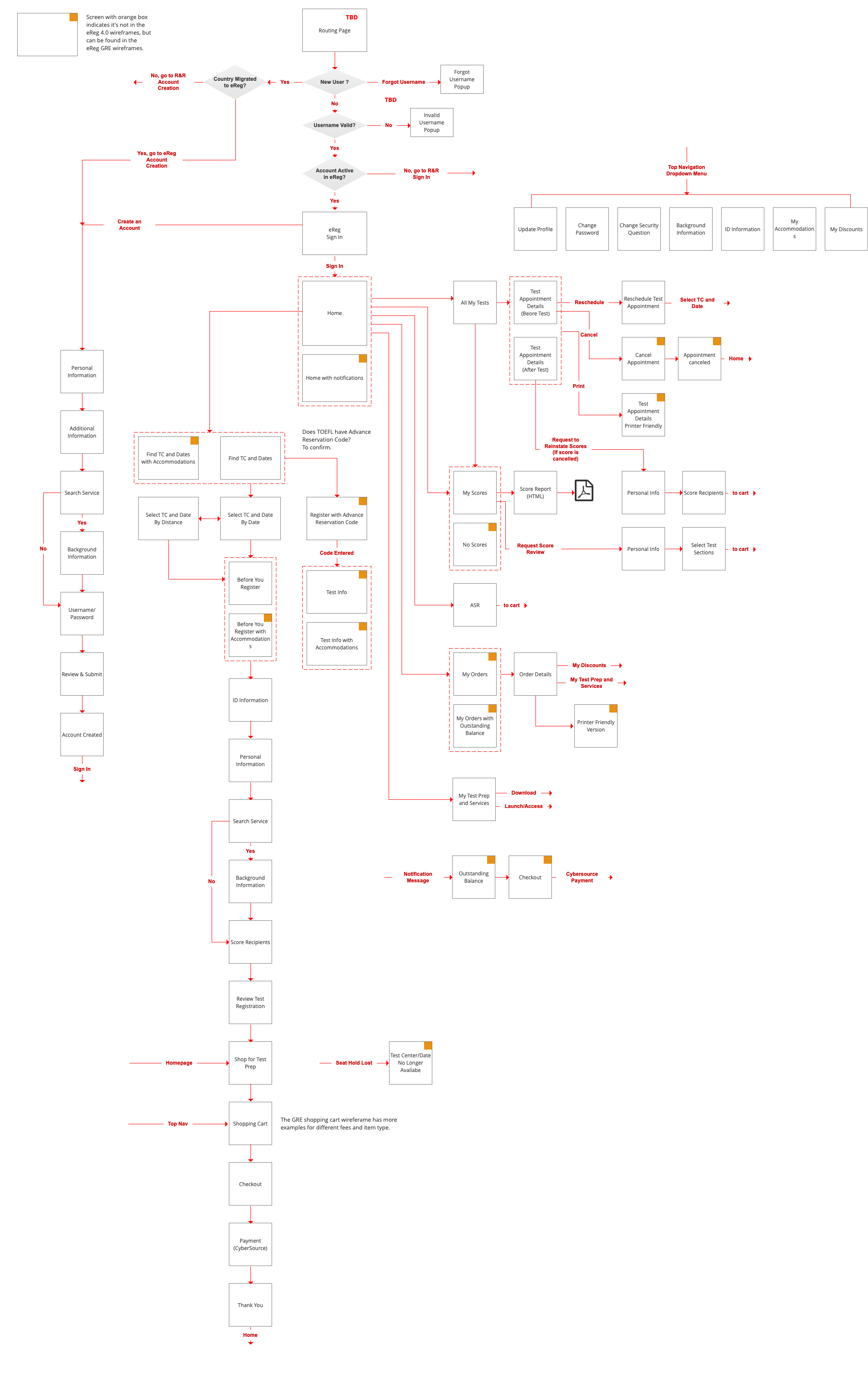
Since there were many screens to design for I broke down the registration system into 4 groups. This allowed me to understand the user flow and make sure each screen was accounted for.
-
- User profile top Navigation
- Homepage navigation
- Create an Account
- Test center/ Registering for test
Issue #1: Functionality
008
Step and Status Indicators
My aim was to ensure that users have a clear understanding of their position within the registration process and are aware of the progress they have made. To achieve this, I developed a steps and status indicator that serves as a visual guide for creating an account and registering for a test. This indicator offers transparent guidance to users, enabling them to comprehend the overall registration process as well as the specific steps they need to complete in order to successfully register. By implementing this feature, users can easily track their progress, feel confident in their actions, and navigate through the registration process with clarity and certainty.

Issue #3: Content
009
Providing Feedback with Important Messaging
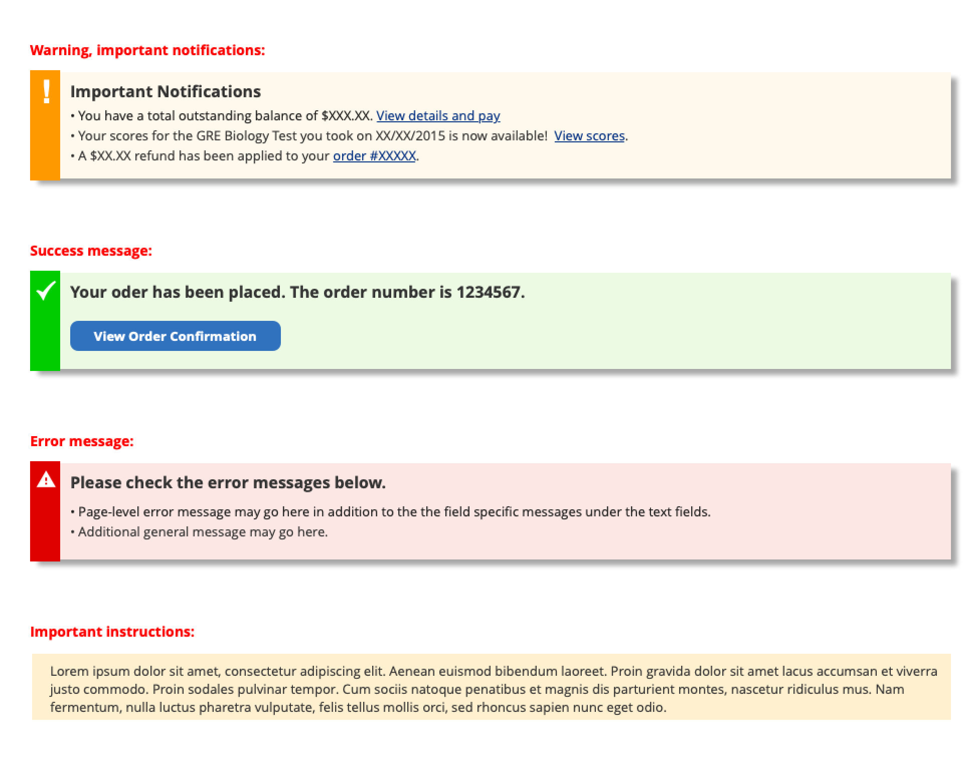
There was a 40% drop-off rate after an important/error message that was displayed. There were a lot of important messaging styles that was confusing the user and lead them to abandon the registration process. I wanted to create a messaging style that is approachable, and friendly, and can help establish trust with users, making them feel more comfortable completing the registration.
Issue #3: Content
010
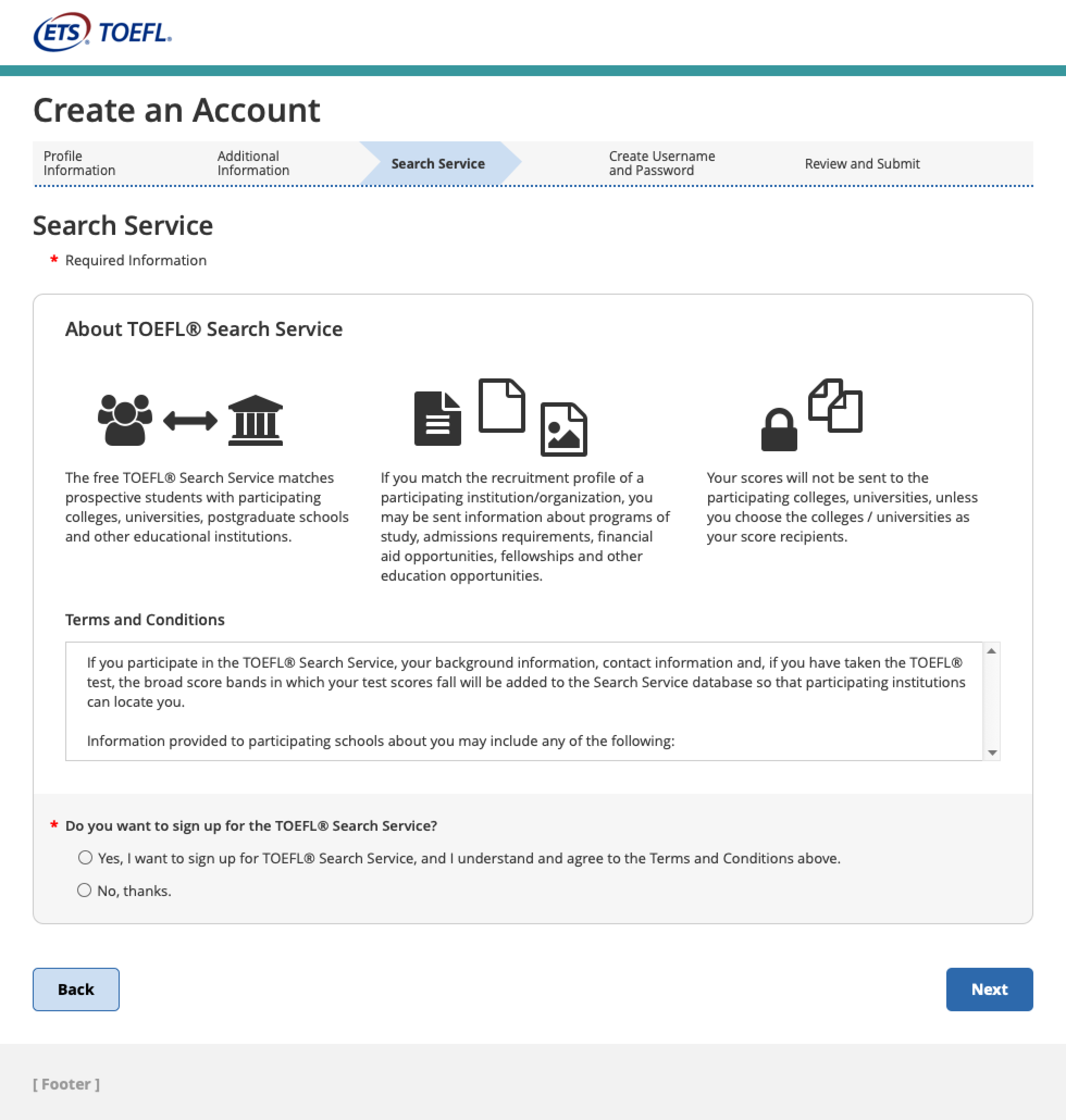
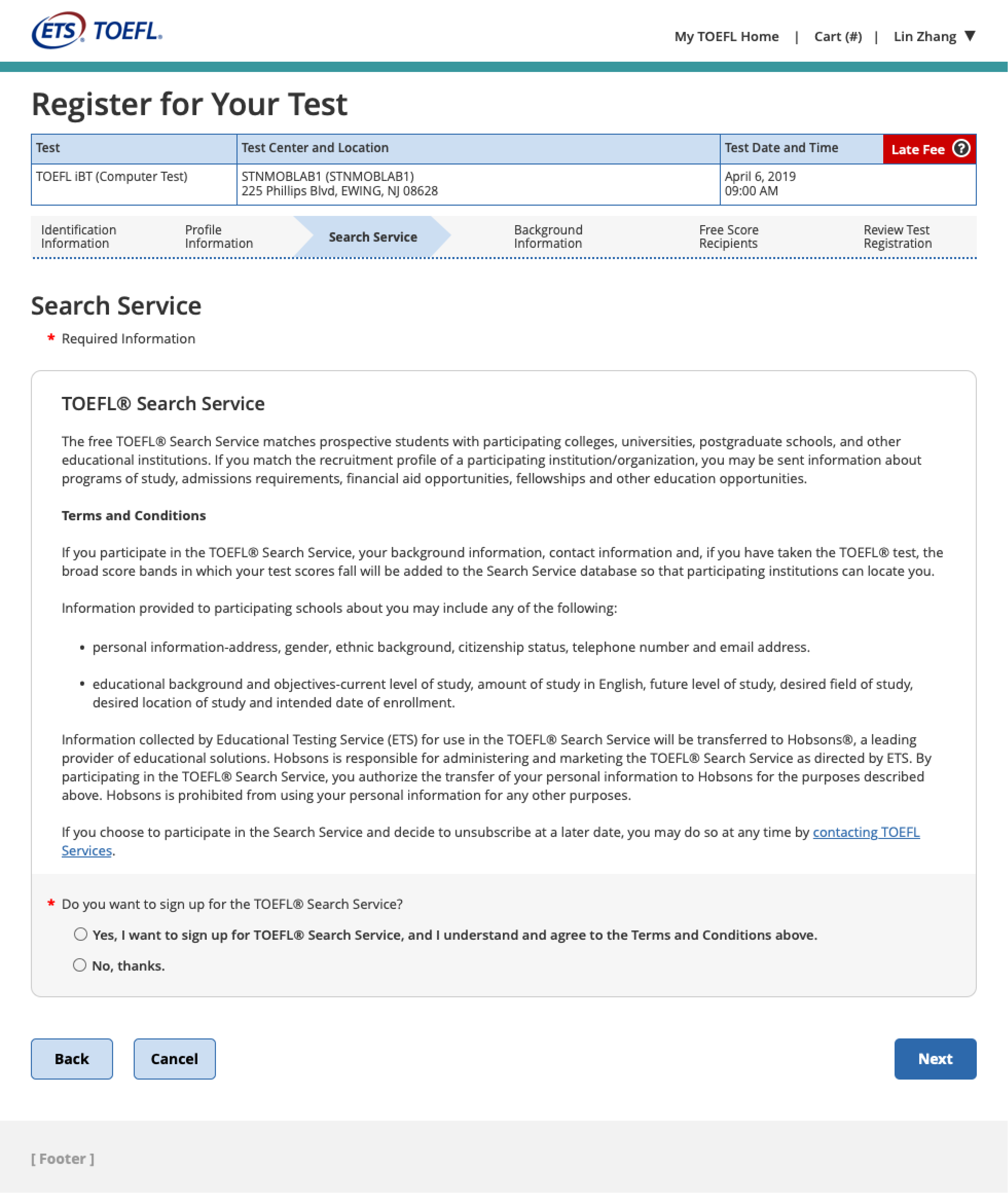
Enhancing User Understanding: Crafting Clear and Concise Messaging to Explain and Promote Search Service
I aimed to ensure the content was easily comprehensible by users through clear and concise messaging. Recognizing that many users were unfamiliar with the Search Service, my objective was to develop a solution that would effectively elucidate the purpose of the service and highlight its benefits to them. We highlighted on the topic when users created an account. Along with creating purpose for it in the registration process.
Issue #2: Design
011
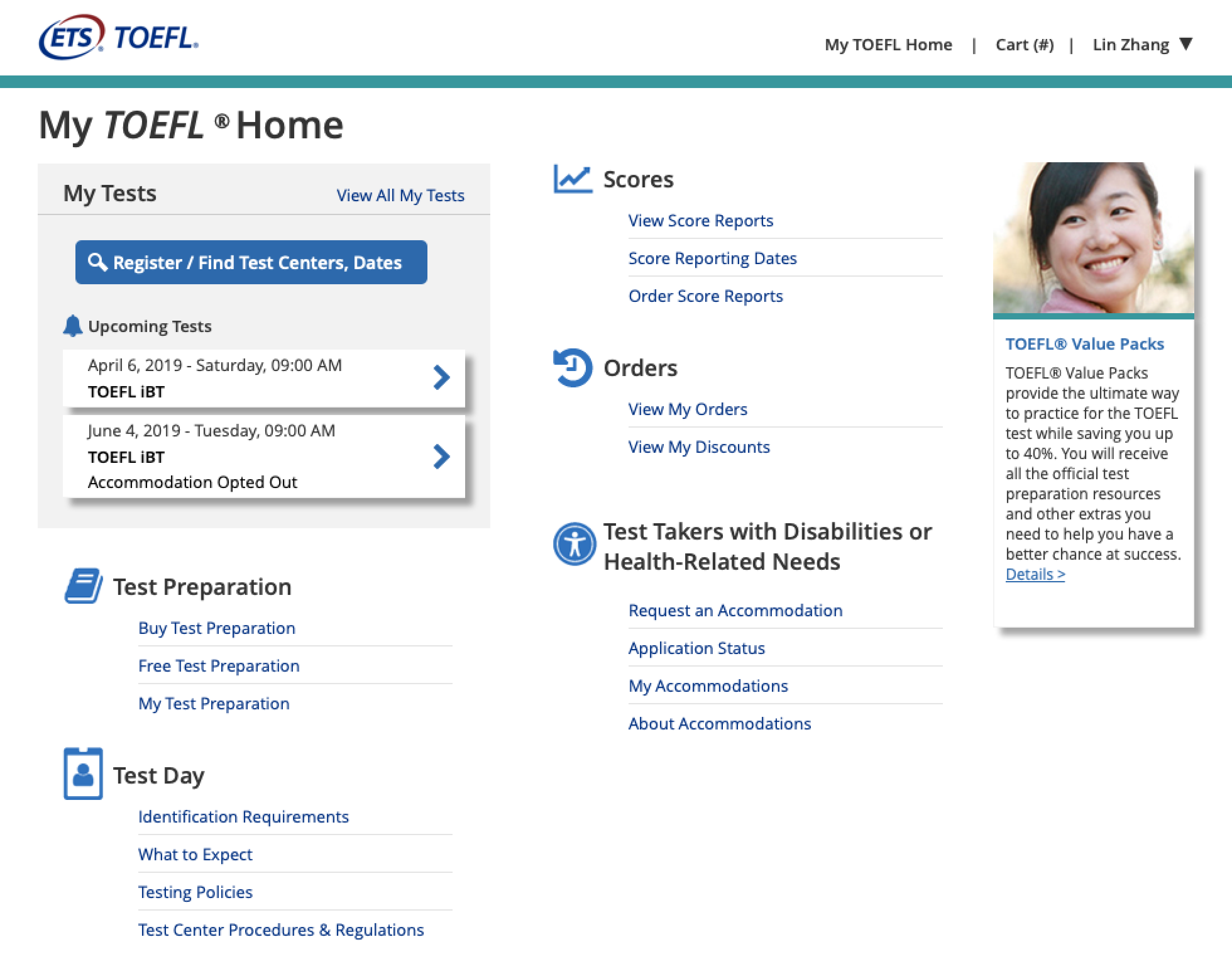
Designing a Homepage
After receiving valuable feedback from usability testing conducted on the existing homepage, I embarked on a redesign journey to enhance the user experience of the landing page. By carefully analyzing the testing results, I identified pain points and areas that needed improvement. Taking into account the preferences and needs of the users, I implemented design changes that aimed to streamline the user journey, optimize information hierarchy, and enhance visual clarity.
Issue #2: Design
012
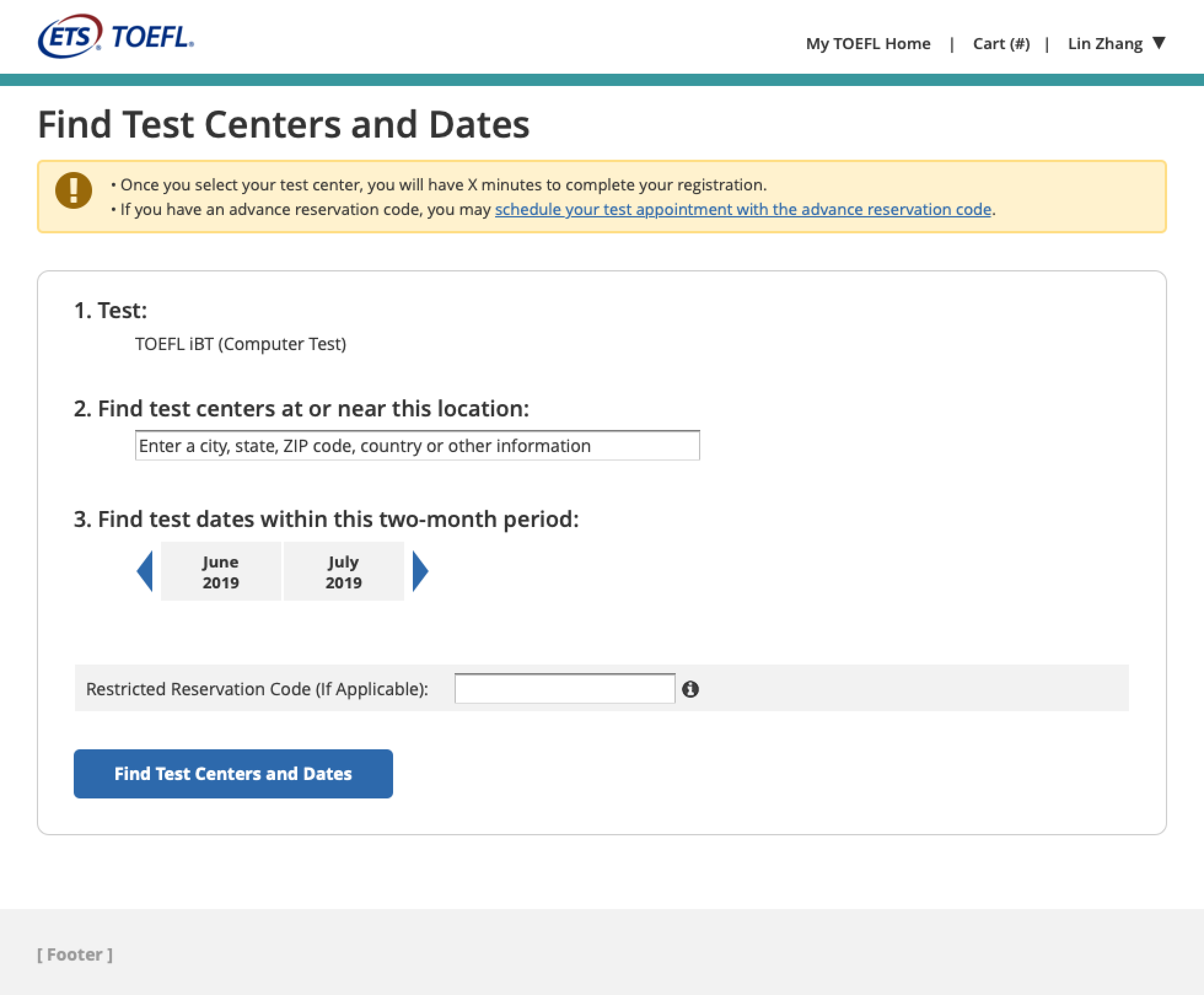
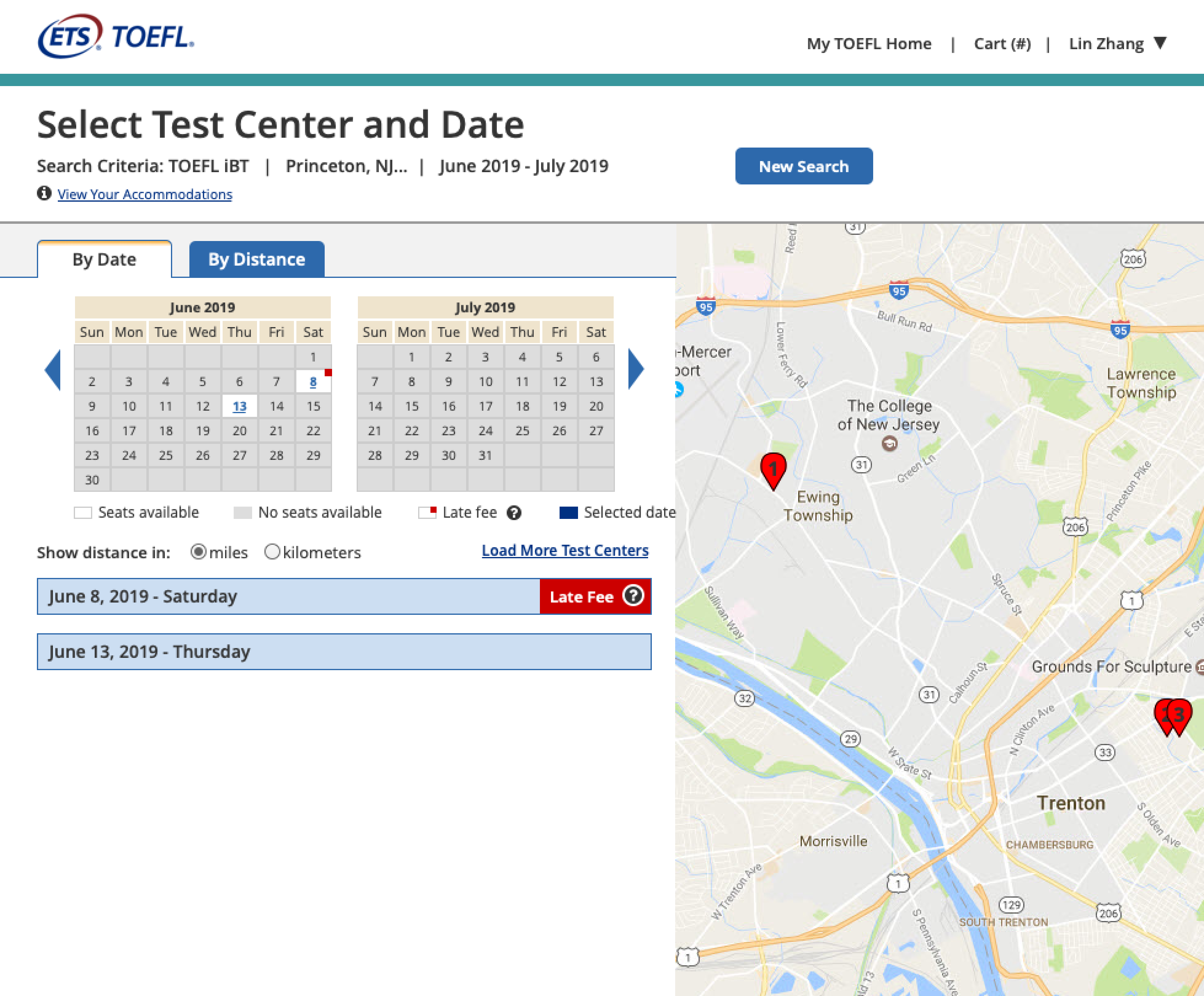
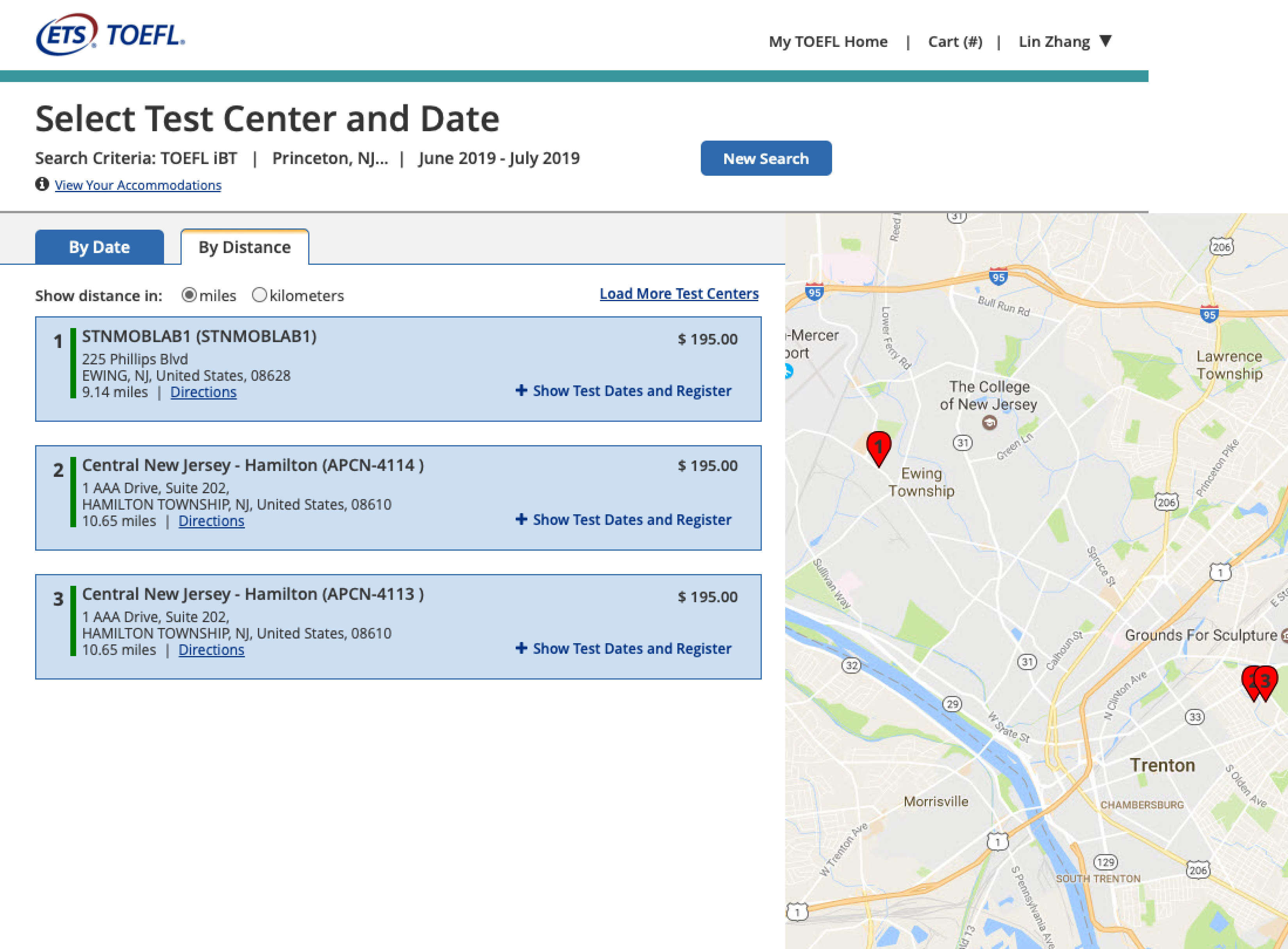
Test Centers and Dates Redesigned
The test centers and dates feature received a significant amount of feedback from users, making it the focal point of our redesign efforts. Additionally, it ranked as the second most frequently asked question in our call center. Recognizing the importance of addressing this user concern, our objective was to revamp the page in order to enhance the ease of locating a suitable test center and date, ultimately streamlining the registration process. By prioritizing user convenience and accessibility, we aimed to create a redesigned page that provided a seamless experience for users, allowing them to effortlessly find the desired test center and date, and proceed with their registration journey.
Testing Again
013
Another Round of Usability Testing
Even though each component has been tested for usability, I wanted to make sure the full onboarding experience worked and made sense. I conducted a full usability test with 7 people. 3 of them had done the test before (to see if the improvements helped them). During the session all test takers were asked to do several tasks related to registering online for a test, making changes to their appointments and accounts and viewing their scores.
I am so happy with the results. The users were able to understand how to register and saw the value. New Users who didn’t go through phase 1 of UT testing were still able to figure it out on their own. There were significant improvements on all tasks.
Final Design
014
A New Registration System
The outcome manifested as a revitalized registration system that not only successfully resolved the identified concerns but also delivered an enhanced and captivating user experience. This redesign aimed to leave a positive impression on users while facilitating effective interactions with the website. By implementing the necessary improvements, the registration system now offers users a more seamless and enjoyable journey, bolstering their overall satisfaction and fostering meaningful engagement
Lessons Learned
015
Reflection on Project Outcomes
Designing a Registration system posed significant challenges due to its global scope and the diverse range of international users it was intended to serve. Our team dedicated ample time to thoroughly comprehend the intricacies of each component, considering the system’s global nature and the diverse range of international users it would cater to. The objective was to ensure a seamless user experience, regardless of geographical location. Through extensive research and analysis, we acquired the necessary knowledge to understand the unique requirements and preferences of users worldwide, enabling us to design a registration system that would effectively accommodate and cater to their needs.
Projects get messy
Lots of changes can make a project very messy. They can also impact the measurement of final metrics. Each change should be paired with a metric we intend to improve. It’s important to organize files for dev handoff. They should have easy access to assets and know exactly what changes they have to make.
Be precise in your designs
Be wary of padding and margins. Developers won’t know what values to set if you don’t. Take the guess work out of it and make your designs as exact as possible. Don’t make your devs designers unless they want it.
